GoRight
Role
Lead Product Designer
Tools
Figma, Whimsical, Notion, Airtable
Year
Overview
A dispatch platform built as two products, made into one
GoRight builds dispatch software for roadside assistance — sending technicians to broken-down vehicles and coordinating that work between dispatchers and the technicians on the road. Before this project, Merlin, GoRight’s dispatch platform, had been built as two separate products: a desktop tool for dispatchers and a mobile app for technicians, developed independently on inconsistent patterns with no shared visual language between them.
I led the redesign of both as one connected system — from an audit of the existing platform through this shipped iteration, across research, ideation workshops, journey mapping, and UI design.
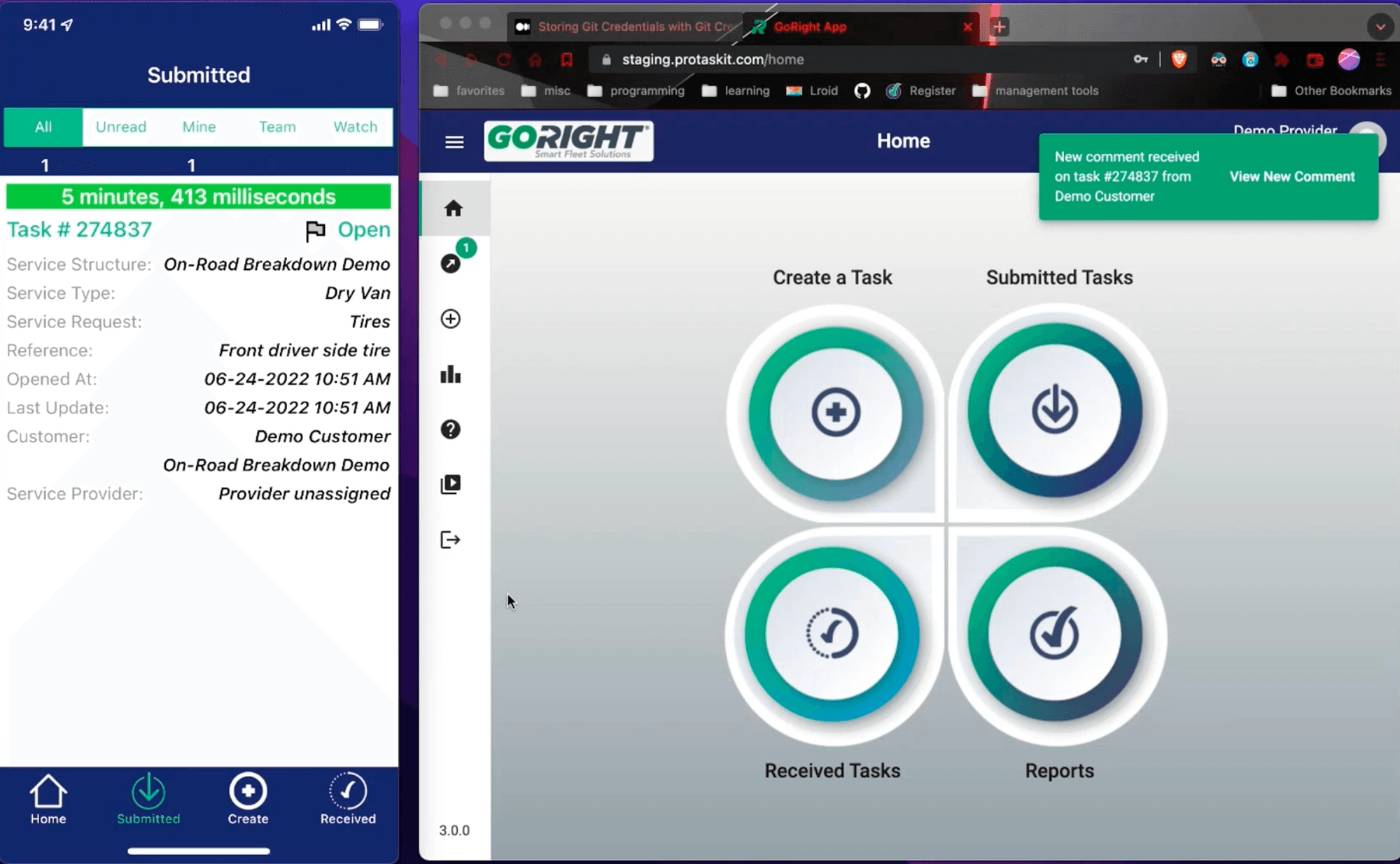
Merlin before this project — desktop and mobile spoke different visual languages.
Pain Points
Two problems, one on each side of the platform
The initial audit surfaced two connected problems. On the dispatcher side, desktop and mobile ran on inconsistent patterns, which showed up as a steady, daily increase in support calls. On the technician side, the mobile app had no real-time updates, so confirming a location or a next step meant calling a dispatcher directly rather than checking the app. Getting a simple overview of on-road activity meant checking several disconnected tools and combining the results by hand.
Project Scope and Design
Audit, workshops, a journey map — then three decisions
I started with an audit of the existing platform, then ran a series of ideation workshops with technicians, dispatchers, and on-road managers. Those sessions mapped the navigation, the feature set, and the breakdown journey before a single screen was wireframed for either product. Three decisions from that process shaped how the platform actually got used.
An early ideation workshop — sticky notes and phone mockups mapping the on-road experience.
An early hand-drawn wireframe, annotated during a workshop session.
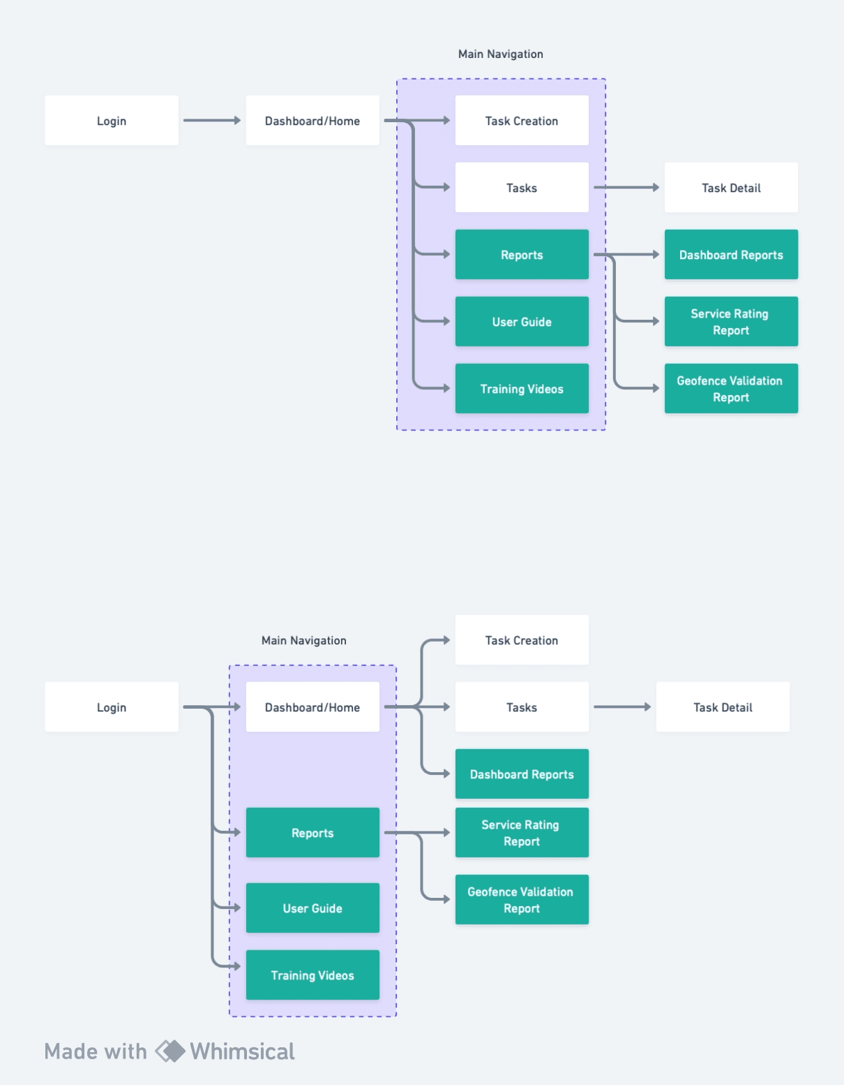
Sitemap — navigation and permission boundaries across desktop and mobile.
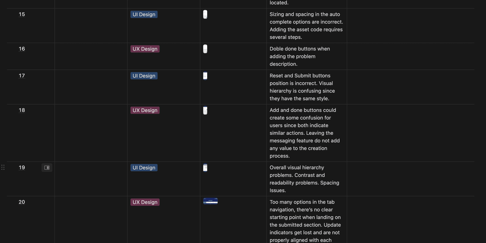
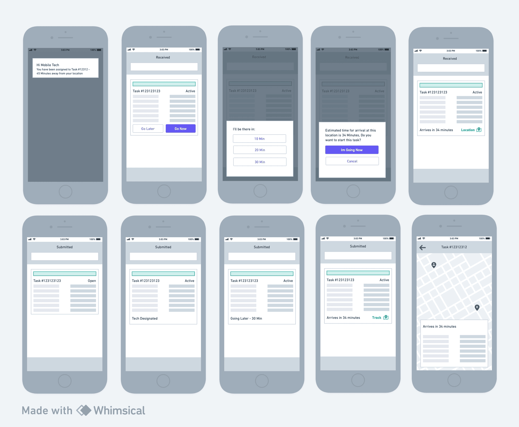
The on-road breakdown journey, from dispatch to arrival.
Leading with tasks, not KPIs
An early version of the homepage led with performance metrics. It looked clean on its own, but testing it with real technicians made the problem obvious: a KPI-first homepage buried the one thing they'd actually opened the app for — their tasks. I rebalanced the layout so tasks led and KPIs supported them, rather than the other way around.
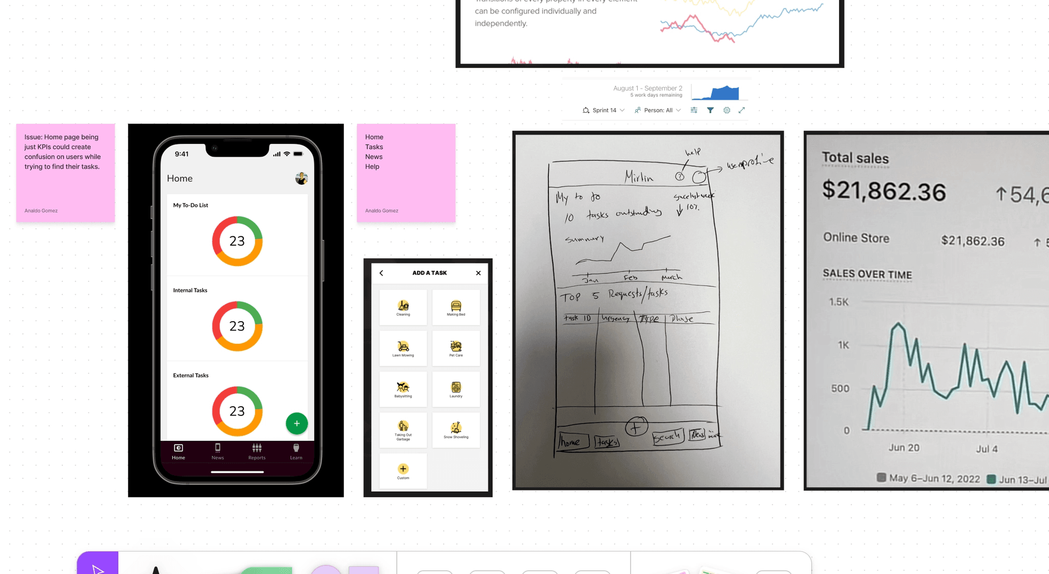
The KPI-first homepage under review, before the rebalance.
Designing for how technicians actually respond
Dispatch software tends to assume a technician accepts a job instantly. In practice, that's not how the work happens, so the breakdown journey branches explicitly for a technician going to a job now versus later, with a notification either way — a real choice technicians make, not an edge case to design around.
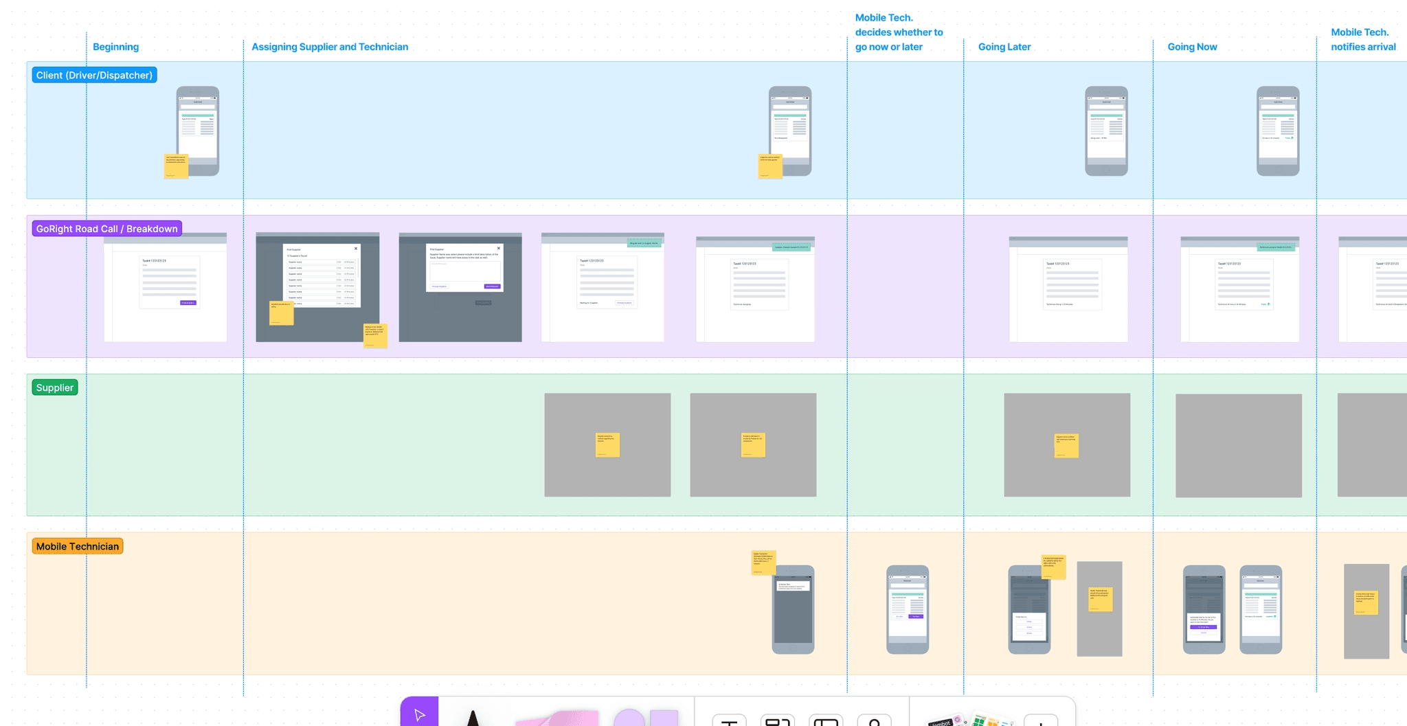
The breakdown journey, branching for how technicians actually respond.
Testing accessibility instead of eyeballing it
Contrast levels were monitored and tested rather than checked by eye. Copy went through a legibility pass. Any sound that could interrupt a technician mid-task was removed. None of that shows up in a screenshot — it shows up in who can actually use the app in the field.
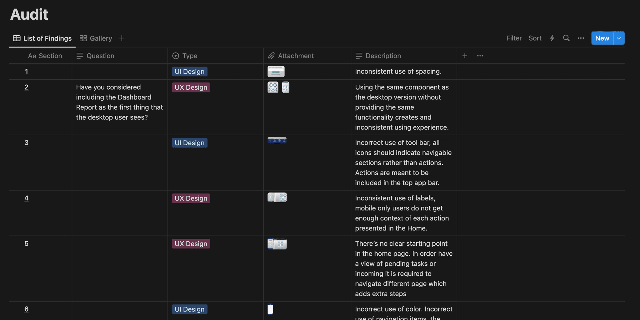
Accessibility audit findings, tracked by section, question, and type.
Challenges
Building a shared system where there wasn't one
The deeper challenge behind this project wasn’t a screen — it was that dispatchers and technicians didn’t share a system to begin with. Status updates happened by phone and radio, which meant nothing was logged and nothing stayed visible after the fact. A dispatcher’s view of a job and a technician’s view of the same job could genuinely disagree, because each side was working from whatever they’d last been told rather than from a shared record. Building Merlin as a real connected intranet meant designing role-based access from the ground up — not adding a filter to one shared view, but deciding, screen by screen, what a dispatcher needed to see and act on versus what a technician did.
- Budget Optimization
- Fleet Uptime/Downtime
- Geo Location Tracking
- Fleet Maintenance
- Fleet Availability
- Trip and Post-Trip Details
- Active Communication and Support
- Driver Roll Call
The clearest sign that structure hadn’t caught up with that intent came later, in a workshop review of a more elaborate navigation. It made things worse: more depth, less clarity, and workshop notes flagged it directly as overcrowded. Fixing it meant grouping related sections and walking back to a simpler version the team had already moved past — treating a finished round of design as a mistake rather than defending it because it existed.
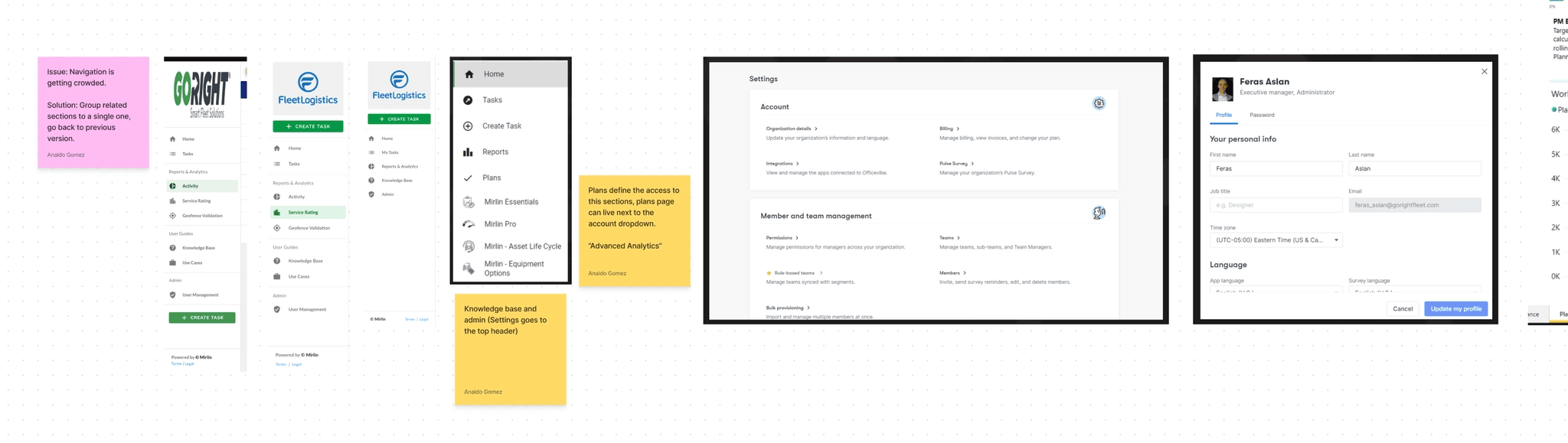
The navigation reversal, documented in the workshop notes.
Strategic Contributions
What I owned, start to finish
My role covered the full arc of this iteration: auditing the existing platform, facilitating the ideation workshops, mapping the navigation and the breakdown journey, and designing the UI for both products using GoRight’s component library and design tokens. I worked directly with technicians, dispatchers, and on-road managers throughout the process, rather than validating finished designs with them after the fact.
The Final Phase
One connected system, closing the original gap
Merlin now runs as one connected system instead of two. A technician’s next task, a dispatcher’s overview, and a weekly report all pull from the same live signal — closing the exact gap that used to send technicians straight to the phone.
In beta, four of the five participating transportation companies stayed on as testers after launch. The real-time tracking built to solve the visibility problem also opened a path the original brief hadn’t asked for: geo-localization as a standalone, monetizable feature.
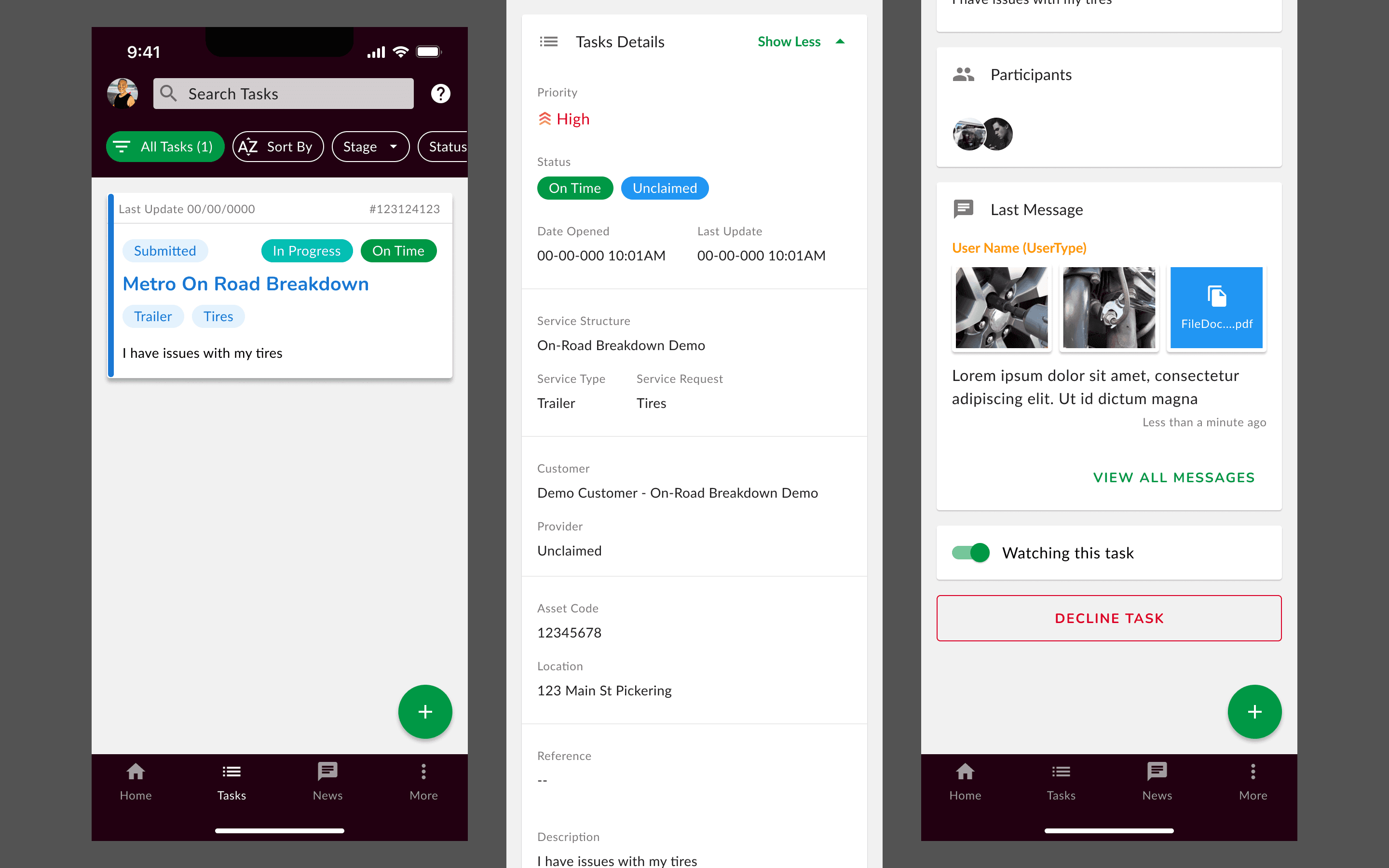
Merlin today — a technician's task queue, live.
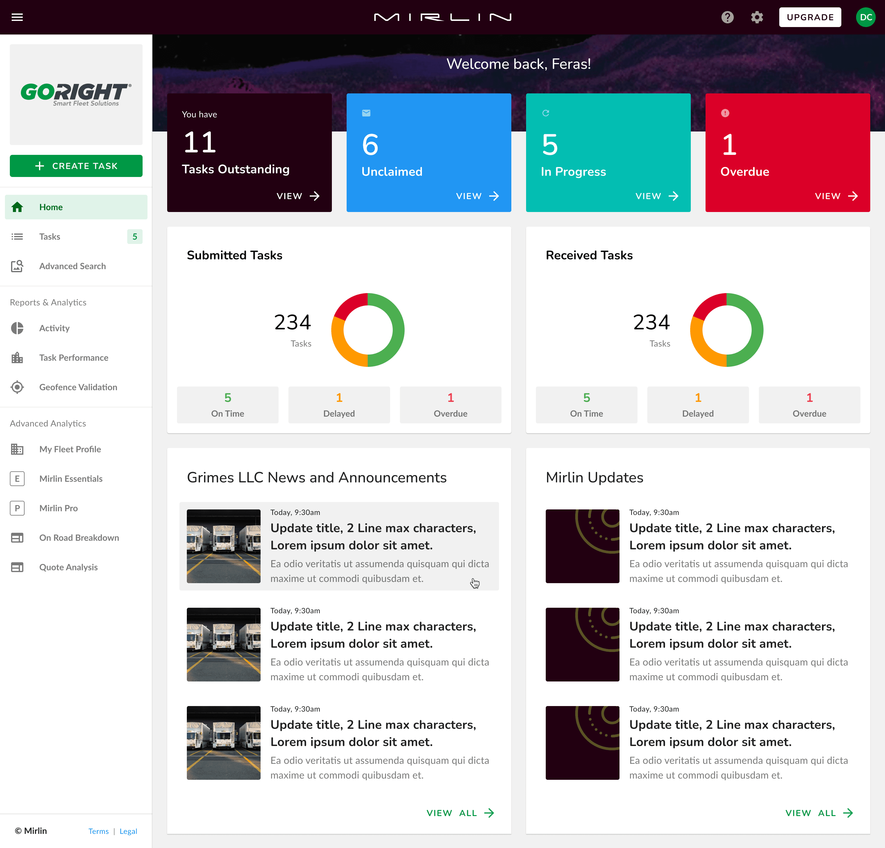
Dashboard — task counts, submitted vs. received, and activity.
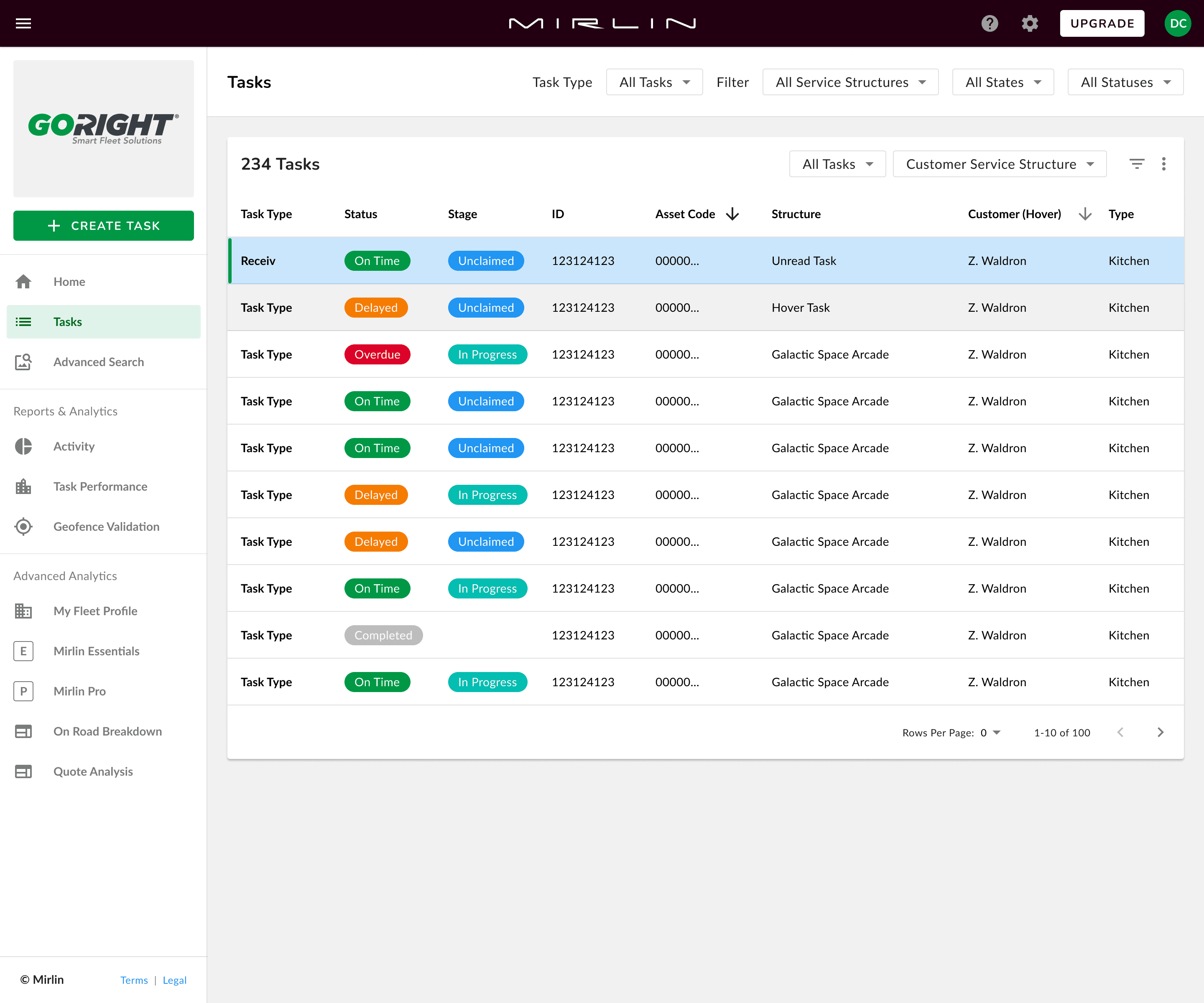
Task list — on-road jobs by status.
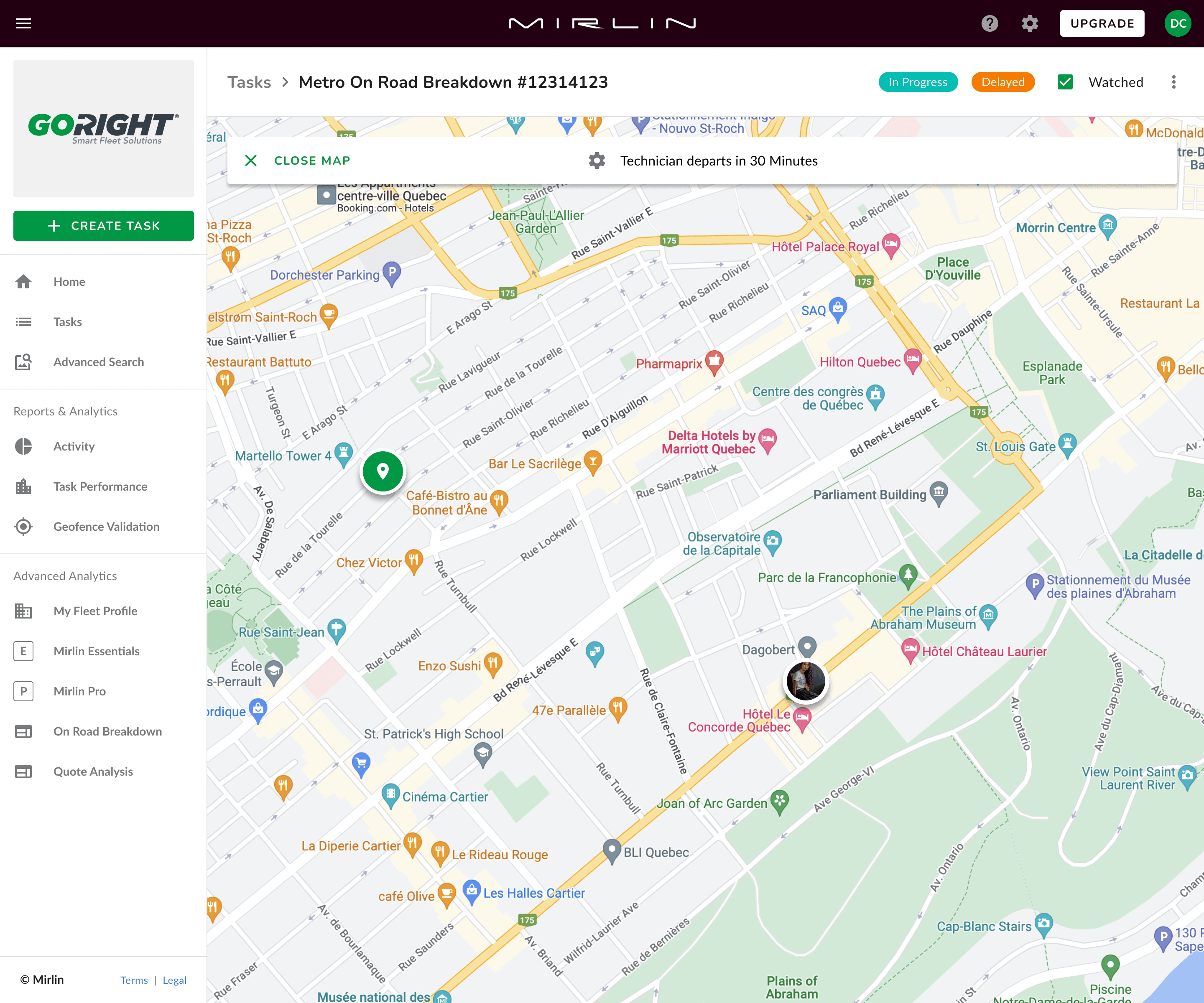
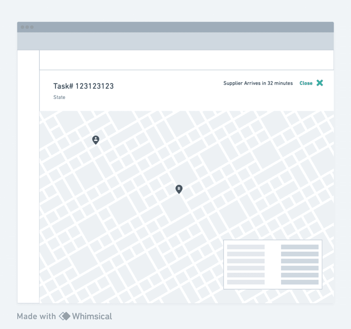
Task detail — live route tracking on a map.
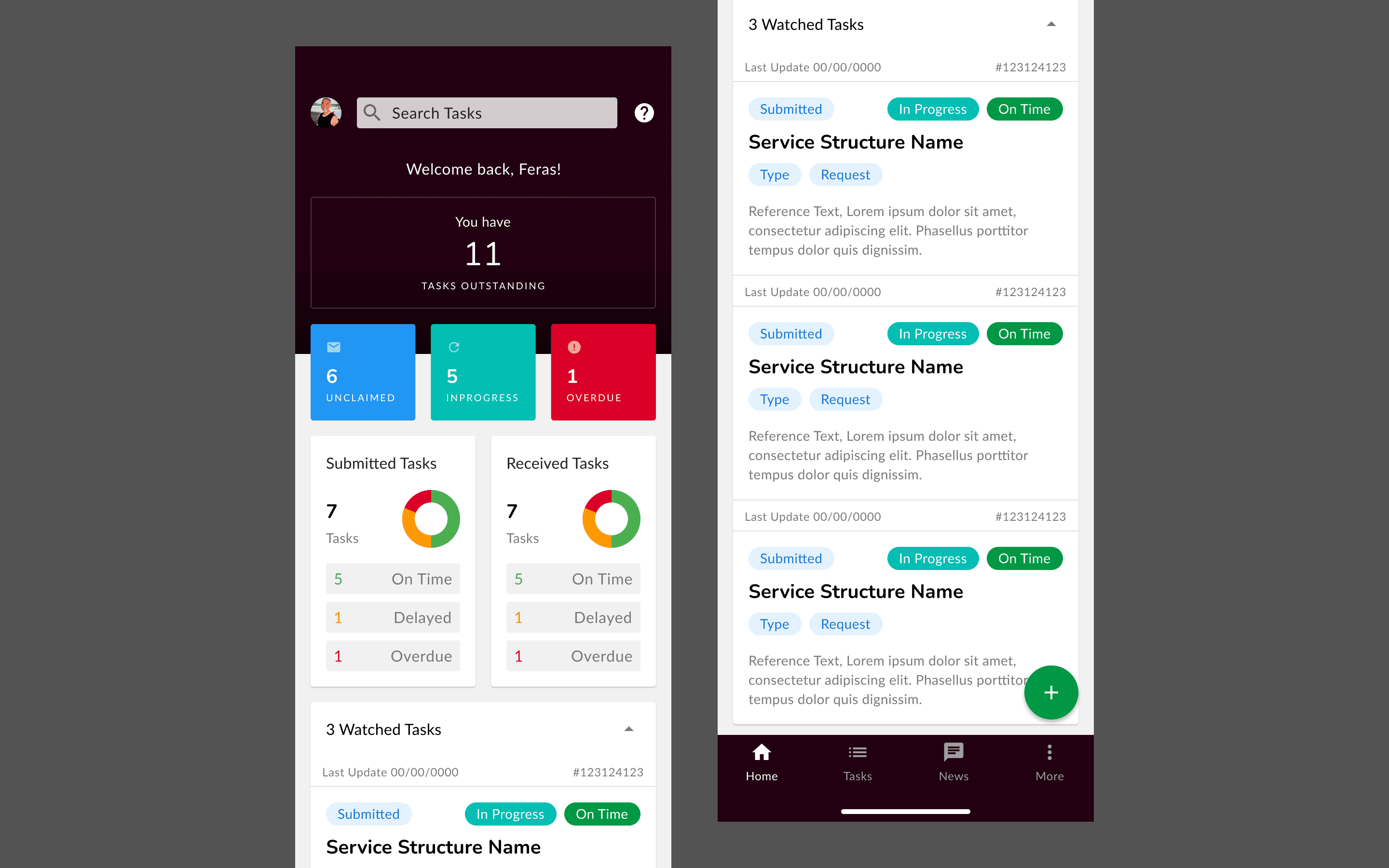
Live tracking — an active dispatch in progress.