Uber Suite
Role
Senior Product Designer
Tools
Figma
Year
Overview
One internal toolset, designed to scale across every team at Uber
Uber Suite is an all-in-one internal toolset built for Uber, consolidating company-wide communication, employee engagement, and AI-assisted knowledge discovery into one experience. I worked on it as senior product designer through an agency engagement with Uber, designing in Figma.
At Uber’s scale, internal communication breaks down fast — information gets siloed, announcements go unread, and finding institutional knowledge becomes a full-time job.
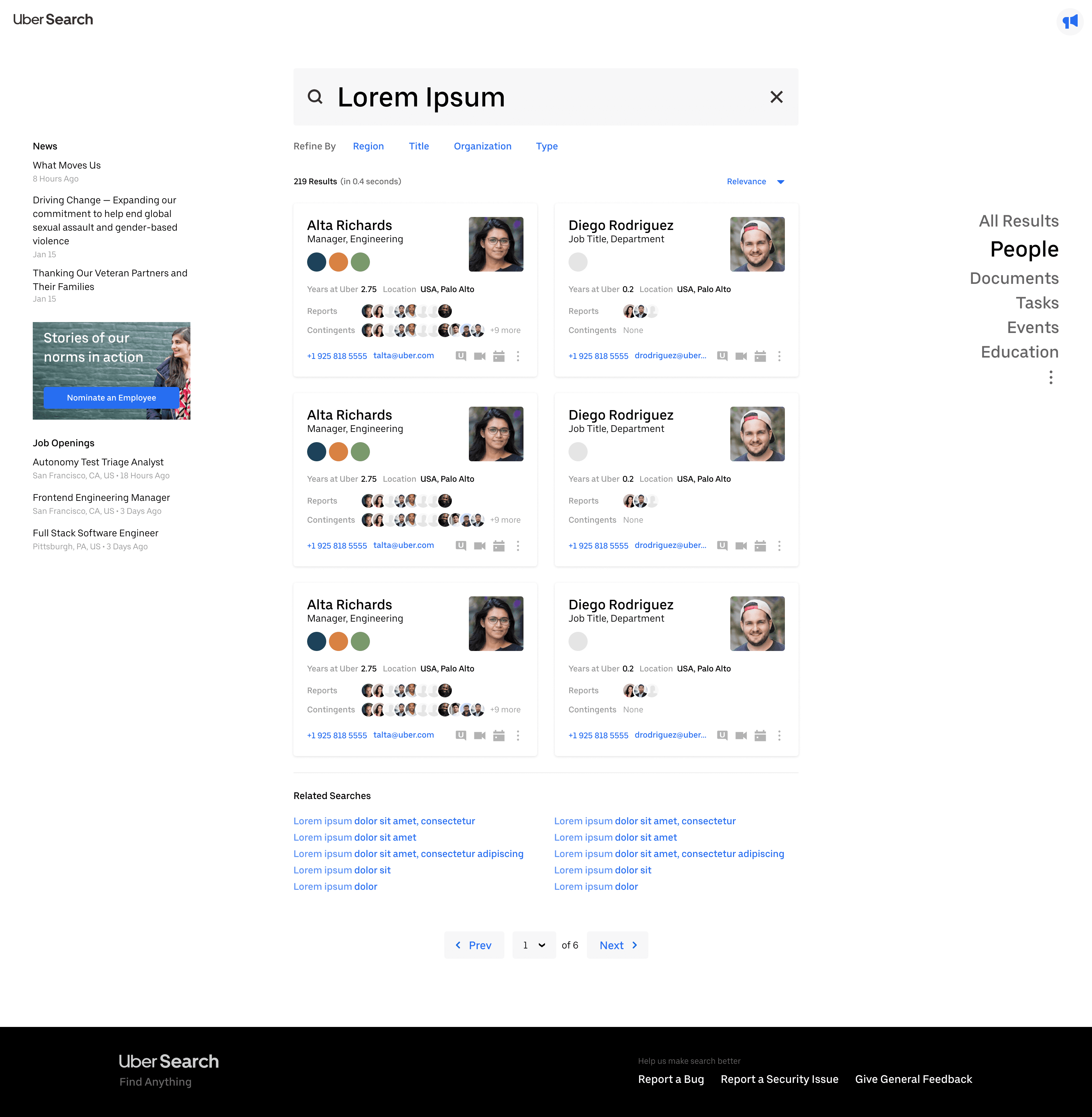
Uber Search — employee profile cards for a company-wide people search.
Pain Points
Too many tools, each with its own patterns and its own login
The problem wasn’t a lack of tools — it was too many disconnected ones. Employees navigating across teams had to learn a different tool for messaging, a different one for announcements, a different one for finding a colleague or a department, each with its own patterns.
Institutional knowledge was scattered the same way. An employee looking for a policy, a past announcement, or the right person to ask had no single place to start — just whichever tool happened to hold that particular piece of information, if they could remember which one.
Project Scope and Design
A unified navigation model, not a one-size-fits-all layout
My focus was reducing cognitive load for employees navigating across teams, so I built around a unified navigation model and surfaced relevant content based on role and context — rather than asking every team to adapt to one generic layout that fit none of them particularly well.
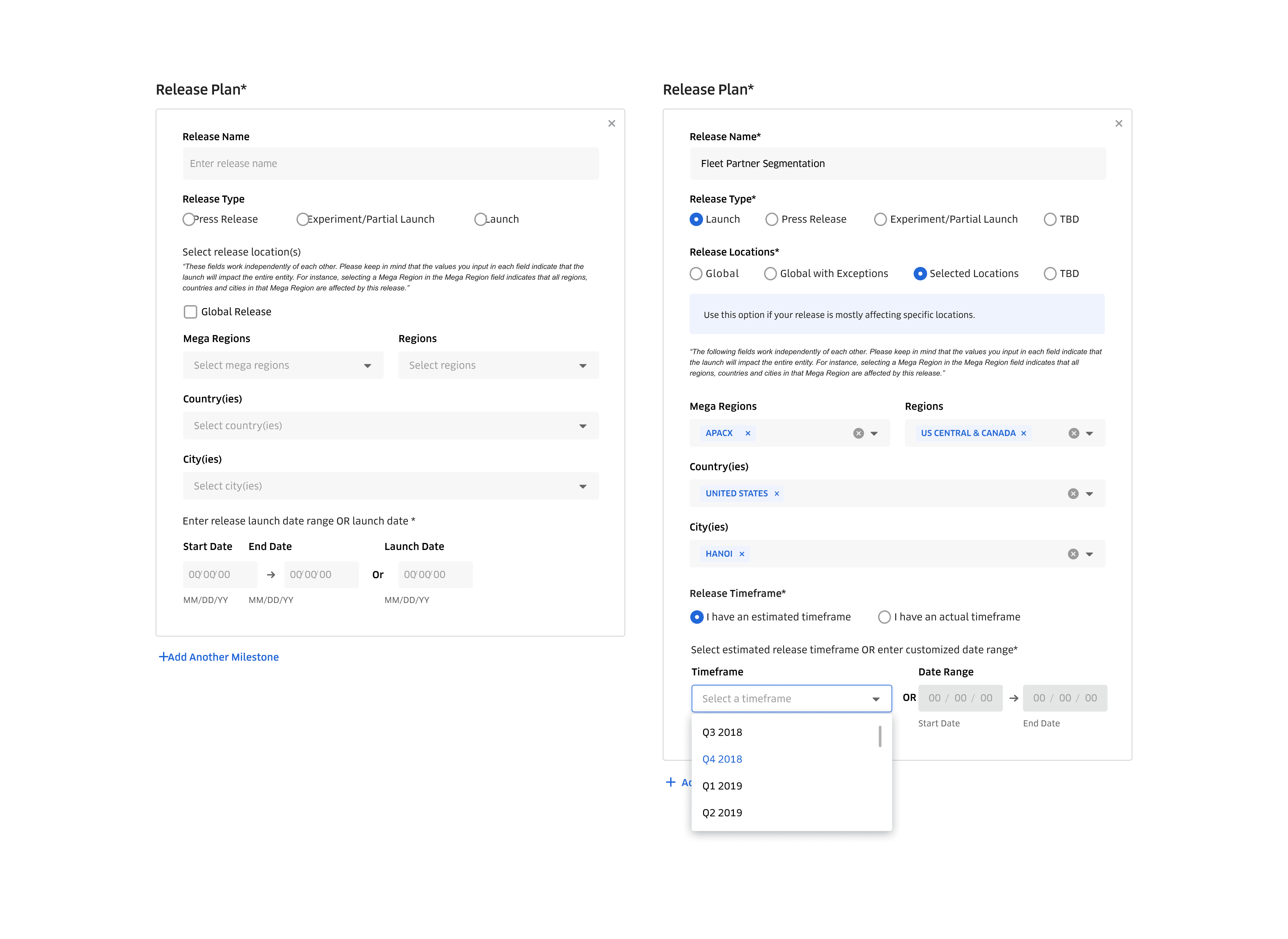
Release plan — configuring a company-wide announcement rollout.
Messaging — a contextual list of users and channels.
Challenges
One system, every device, every team's own use case
The hardest constraint wasn’t any single screen — it was building one design system that had to scale across every venue employees actually used it in: desktop, tablet, and mobile, each with real differences in how people worked. It also had to scale across every team at Uber, from ops to engineering to support, each with tools and use cases already embedded in their day. A rigid system would have broken the moment a team’s workflow didn’t match the template; a system with no shared spine wouldn’t have felt like one product at all. It had to stay consistent enough to read as Uber Suite everywhere, and flexible enough that no team felt like they were working around it.
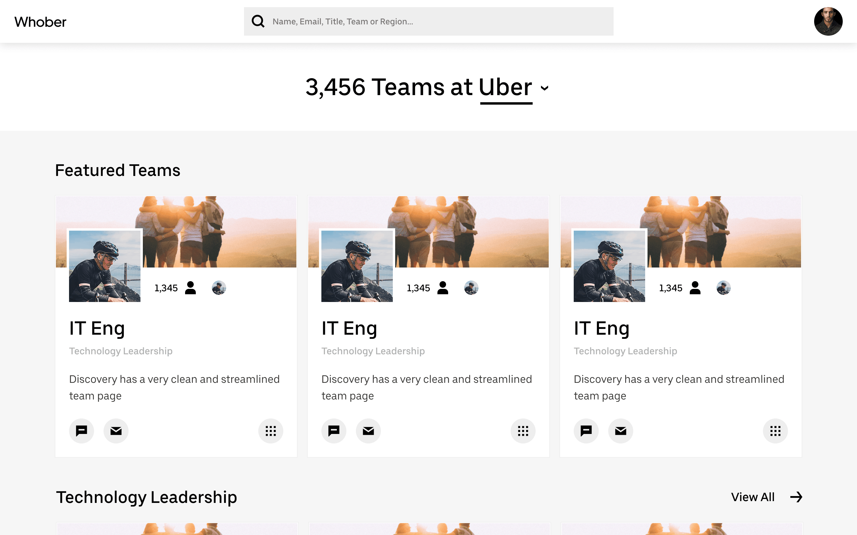
The same system on desktop — announcements and release management.
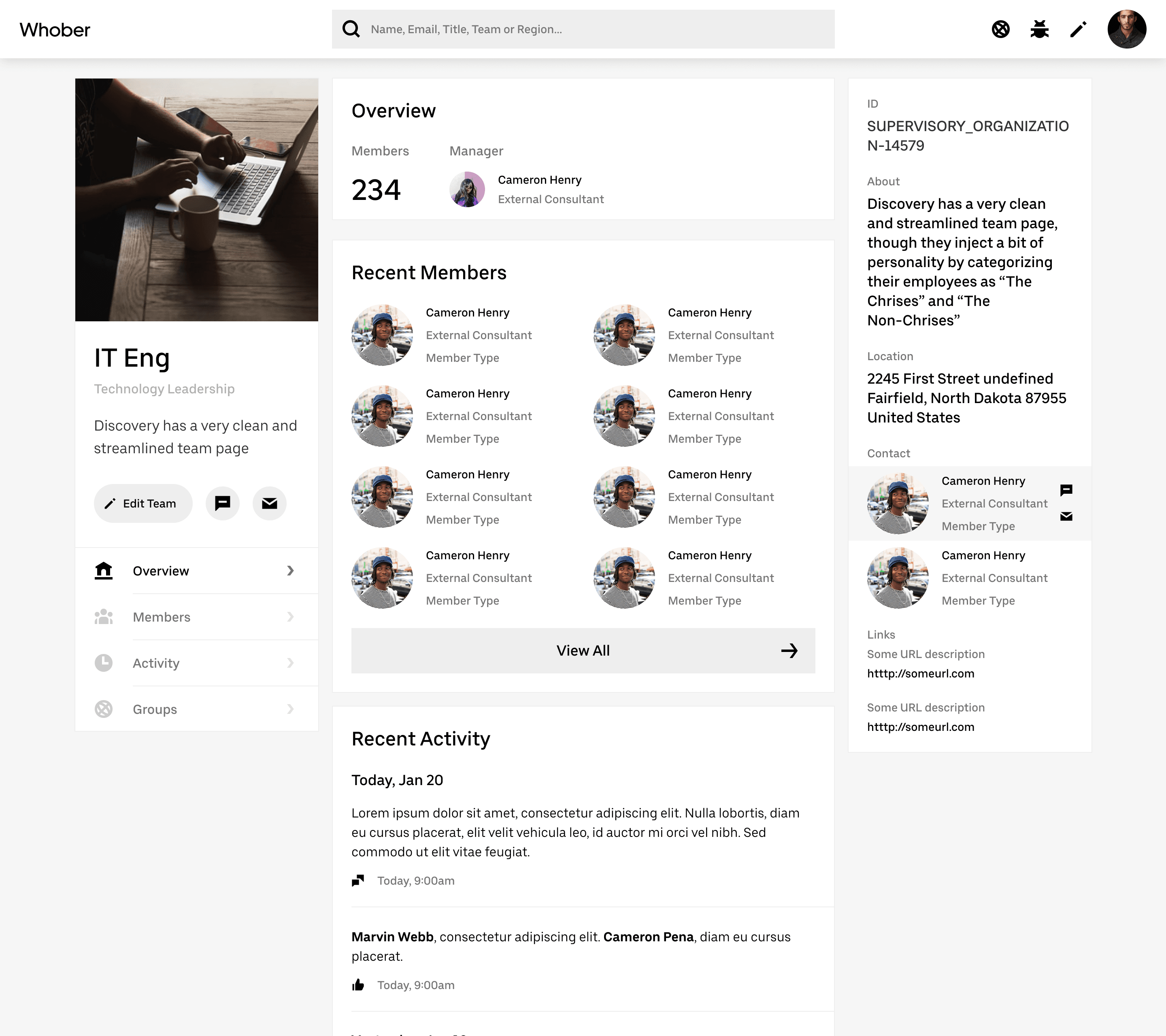
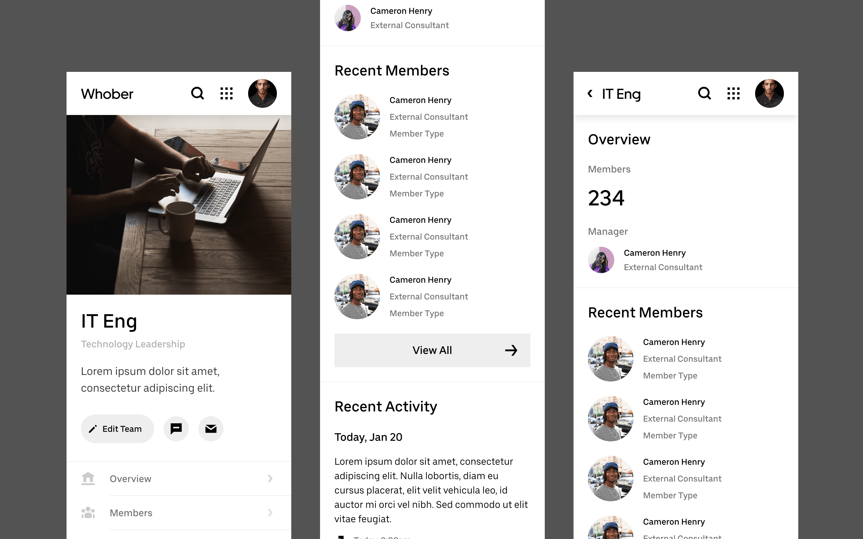
The same system on mobile — team profiles and a department page.
Strategic Contributions
What I owned, start to finish
As the agency-side senior product designer on this engagement, I was responsible for the interaction model and the design system itself — the patterns that had to hold up across desktop, tablet, and mobile, and across every team’s own version of the product, not just the screens for one team’s workflow.
The Final Phase
Scale changes everything about how people communicate
Consolidating fragmented internal tools into one surface reduced the time employees spent context-switching and surfaced relevant information faster.
There’s no single number that captures it — the real result was a system that held together across every team and every device it needed to run on, without a separate version for each one. Adoption came naturally because the tool fit how people already worked, not the other way around.
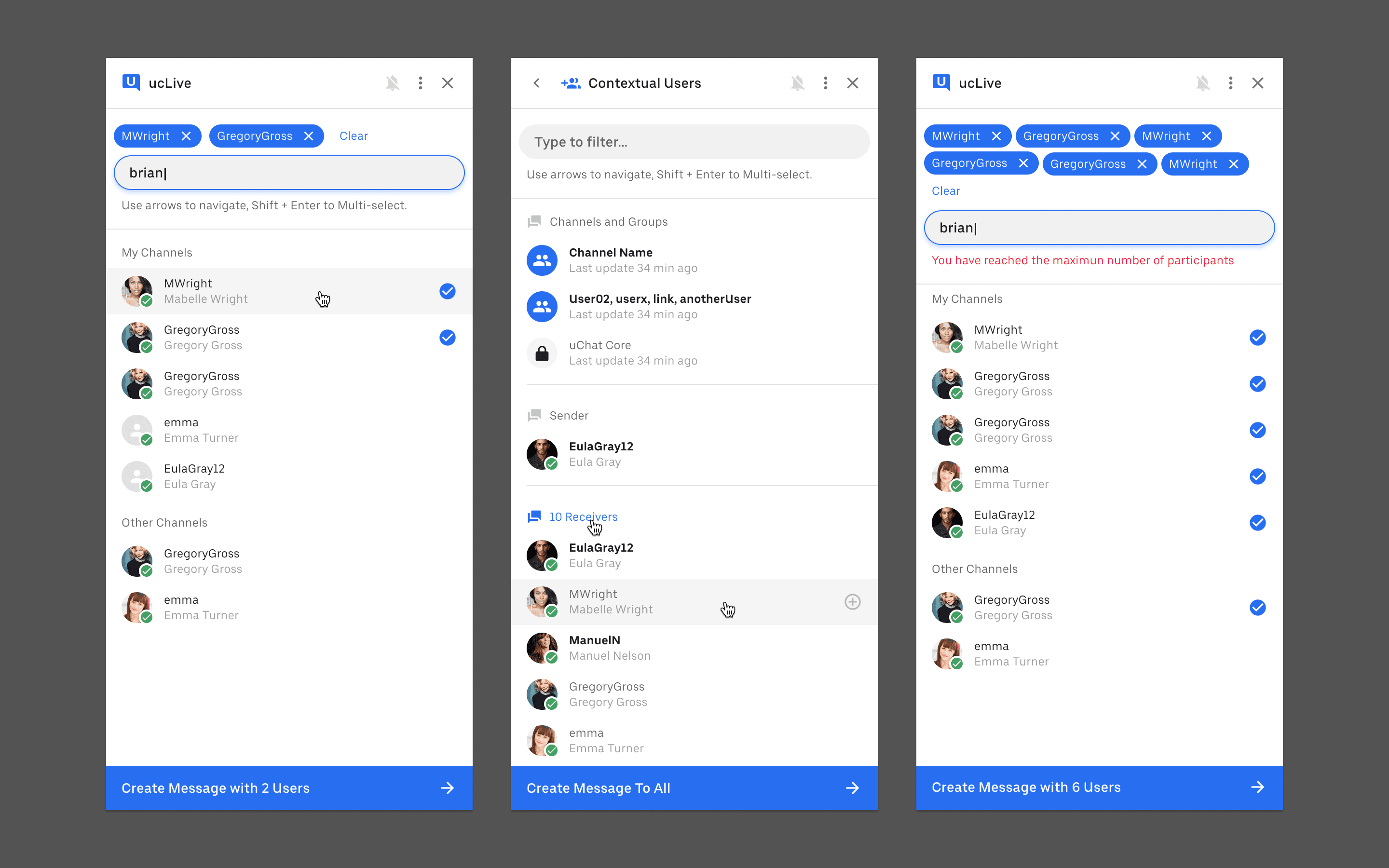
Messaging — channel search and multi-user selection.
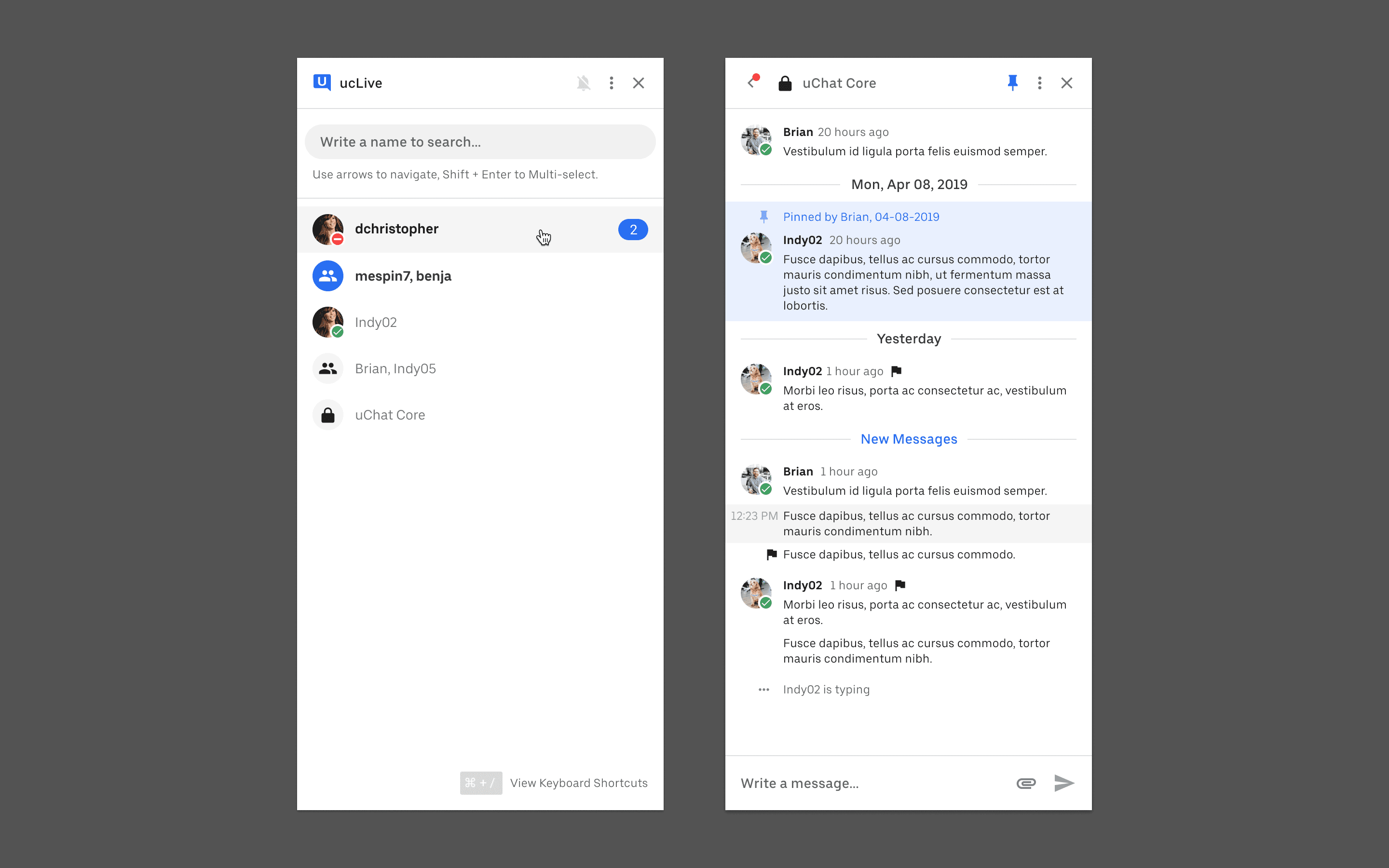
Messaging — a conversation thread between team members.